Jane Newbery Student 145415 OCA. 2014
LEARNING LOG
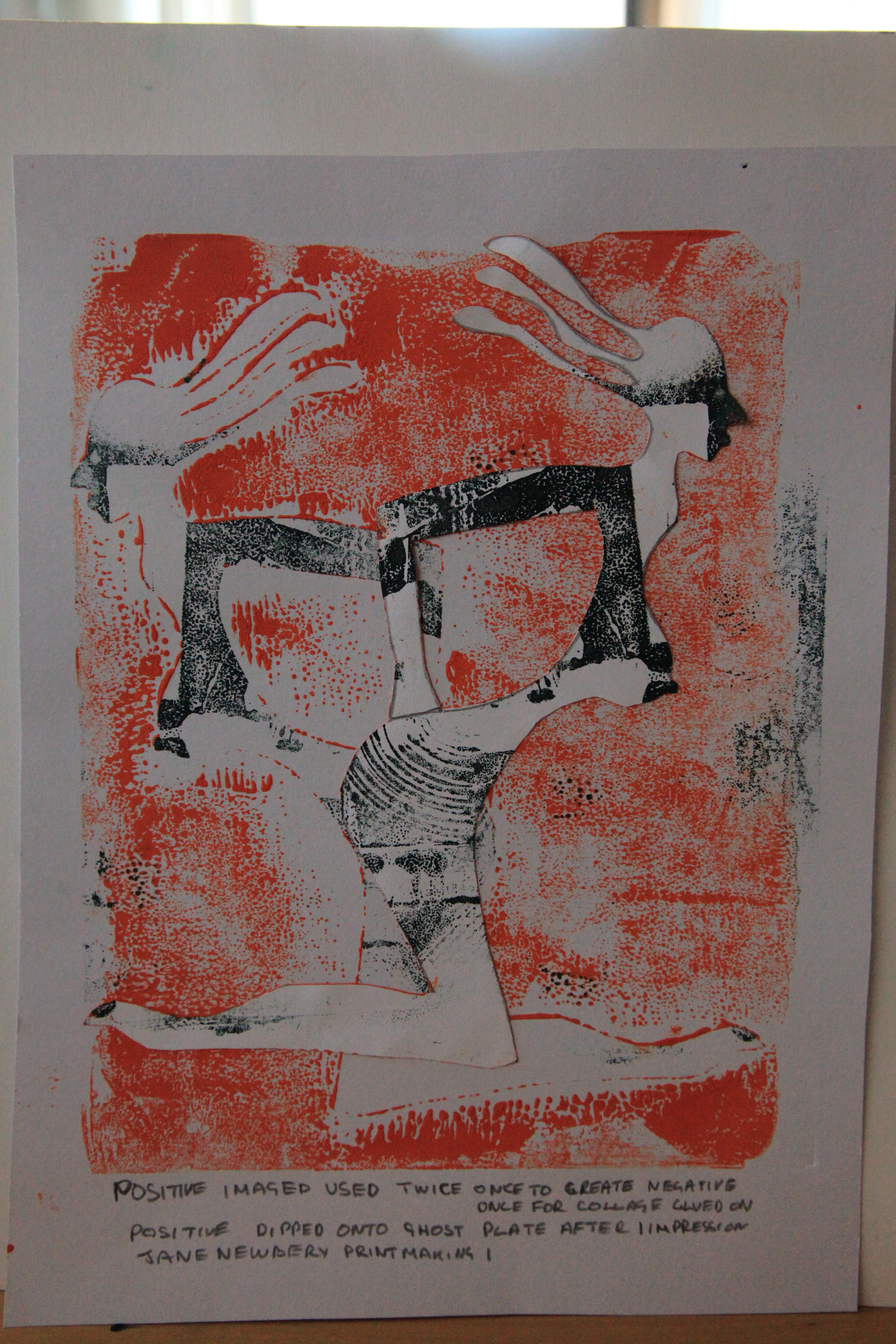
PRINTMAKING 1.
MONOPRINTING.
The simplest form of printing, using printing inks, painting with brushes various marking implements directly onto glass Perspex or metal. One impression can be made, by laying the print paper over the plate, applying pressure and lifting to reveal the impression.
It must be remembered any impression made will be revealed in reverse.
Printing Inks.
WATER BASED INK.
Advantages
Dry quickly allowing extra layers to be applied quickly
Water used to clean or thin paint.
Suitable for most types of paper.
Disadvantages.
Can dry too fast.
Colour can be patchy and thin.
Colours can bleed when wet.
Not suitable for soaked paper.
OIL BASED INK.
Advantages.
Slow drying flat colour.
Can be used on damp paper.
Can be diluted with solvents and oil.
Good even coverage.
Suitable on thin papers.
Disadvantages.
Solvents needed for cleaning, or thinning.
Long drying time.
EXPERIMENTS.
RESEARCH POINTs
BLUE NUDES.
Looking at the quality of the cut, I can see it has been done sharp and clean, curves beautifully rounded.
The colour, pleasing to the eye, even at distance visible contours.
There are a number of floating pieces arranged from the main body cut, giving white space and shape to the print.
Degas’s minimal print lines suggest the image, as if he were working with a graphite pencil to plan his work.
Earlier sketches played an important roll in his method, allowing him to see the outline of his intentions, later after printing, filling colour, texture of leaving white space, or paper space depending on the colour medium he printed on.
ANSELM KEIFER
I recently attended an exhibition at the The Royal Academy of Arts.
Anslem Keifer born in Germany in 1945, his career has taken him to study all possible elements of Art. His pictures are constructed from Mono print cuts organic material and many textures found in natural mineral and fauna.
Hi cut out of mono prints are large, some 15 – 20 ft high, often cuts of trees and parts of buildings mixed with cuts of photography all to build one picture.
The colour dark and deep greys and greens, his depiction of war and suffering often his subject.
A selection of his work is in my sketchbook, in the form of postcards
I will be drawing a few studies from these, as the exhibition was so crowded I could not study.
PICASSO
GUERNICA
THE images were more complicated often laid over one another, depicting man and animal, the composition forms a circle of the eye to follow his subject. Colours of sepia white black, textures, abstract but bold.
DEGAS
‘REPOS SUR LE LIT’
Looking at the background of this Mono-print I could see Degas had scrapped away areas to form texture of walls, bedstead and carpet, The background white medium used to improve the textured image.
The figure minimal suggestive lines against white, gave the desired effect Degas wanted.
Smudged cloudy marks to give the bed edge a plump image.
Dark against light revealed his work.
‘THREE GIRLS IN THE RECEPTION ROOM’.
The three women in this Mono-print seem to be similar, probably a sketched study of the same women in different poses, the hair and nose almost identical.
Dark against light his signature to reveal the impressions he wanted.
The use of the paper colour an important role in giving texture and depth.
The scrape marks clearly visible, the dabbing of the smudges in the foreground.
Finite lines to edge the body, curved scrapping to give volume.
Dark hair colour on the two foreground women, the third appears to have the front of her hair catching the light from overhead, by leaving white space.
CAFÉ-CONCERT AT THE ‘AMBASSADEURS’
The same visual awareness of the women, the Woman in red, her arms caught by the light, as in above two tone Monotypes.
The position of the double base against the red dress, give scale and movement.
The background scrapping under the leaves, and on the end of the woman’s arm in the red dress, show contrast.
The skeleton of this picture, before colour, maybe, a second ghost print,, allowing Degas to fill in over texture with pastel coloured.
OTHER ARTISTS.
PAUL KLEE
THE TWITTERING MACHINE
Back drawing the main imagery gave fine lines and impact against the blue purple and pink smudged background, you can clearly see the impressions of ink on paper shaded across the picture.
The more gentle wash of watercolour over top, the visible drying lines of colour.
A print is in my sketchbook.
Back drawing I have found one of the most valuable Projects I have undertaken I can see where it can be used time and time again to achieve the result you want , especially with fine line drawing and textures at distance.
CONTEMPORARY PRINTMAKERS.
PERLA PEQUENO
A graphic designer and Architect .
Her imagery abstract good fun, texture and shape with colour all add up to a well balanced art work that can by used in advertising or gracing any contemporary household.
HOKUSAI’S
OCEAN.
This print is one of my all time favourites, the whole structure and movement of the sea is translated off picture into the imagination.
The use of colour an very small dots creates the perfect atmosphere and allows you to almost touch the sea.
PAINTING MONOPRINTS FROM LIFE
Wood and ceramic were my choices, the light would reflect off the ceramic against the wood grains dense but colourful textured treacle colours.
The space I kept plain to help me concentrate on the space rather than the objects, the plain space in practice helped.
After painting the background the shape of the ceramic vase and shoe last were revealed.
Painting in the colours of the two choices made me concentrate on what I was actually seeing in the way of colour, and light reflection, just as I had seen in Degas Mono-prints.
I tried the exercise again this time without the light of the window,
LIFE STUDY.
Painting the background first was interesting I was constantly looking at the shape behind, trying very hard not outline the subject.
I found this a quick tasks and I like the free drawing result.
One of the subjects I choose was a blue bottle, I found once looking at it, with a blue background, the background almost obliterated the bottle with reflective colour.
I tried the Vase and Shoe last in two different lighting effects, one with the blinds open, one with them closed.
The colours changed completely much darker, flat colour.
DRAWING CUT OUTS
My first attempts were not satisfying, the ink seemed to dry too quickly, I thinned the ink with a little water but still had the same problem.
The prints were good as ghost prints but not clear good block colour.
I had my fan on in my work room the temperature 37 degrees, I decided to shut all doors and use Air-con to reduce the temperature to 25 degrees, this worked, my paints were pliable for longer.
I experimented for 2-3 hours just dabbing and using different brushes and other mark making equipment, e.g. brush ends, erasers.
Some prints were strong and vibrant from painting slightly thicker colour and strong brush strokes.
Thin brushes gave soft line effects.
Pulling the eraser over two colours crossing over gave a dragged effect through the colours, where the colours crossed the base colour changed, base line colour dragged along with the top colour.
These experiments I like, I could see where I could print texture, either with one mono-print or over printing a second layer, forming a part ghost print, part deeper colour image.
Dragging the wooden end of the brush through the print plate left indentations, or if you applied a wave effect caused ripples to be printed.
The possibilities of forming a finished piece of work, not from drawing but from mark making are endless
Drawing a cut out was a long process, each design was great on paper but some of the subjects lost their impact when cut. I realised it was down to shape, no filled in detail on the body.
Matisse proves this with his powerful Blue Nude it has intricate cut shape with suggestion of movement and contour.
Icarus falling is an outline with no inner contour lines.
MARK MAKING
Task I
An enjoyable start, working very quickly through colour and textures gave me the confidence to move forward. I liked this work and found myself arranging the marks with good composition.
I decided to use different types and paper in colour and texture throughout this task. It gave me a broader overview of textures capable.
My favourite mark maker was an eraser with a slanted edge on each end, I found numerous ways of twisting to achieve shape as in the ble and green organic marks made.
TASK 2
My first print the Mask of a body sitting on a stool, their arms entwined, doesn’t give the impression I intended when drawing.
The print impression was good, the ghost I liked better thinking I could over print, to give depth.
I worked through this image to see if anything changed when I reversed from positive to negative, I did get better results when I worked with multi texture and masks.
The Ballet dancer worked much better, a slim more continual line.
My attempts to march positive and negative were a success, I found printing the top of the picture and working slowly down keeping the paper square was the answer.
The Norfolk swimmer did give the impression I wanted, the shape more slender, more detail in the cut, giving impression of floating hair, and body movement I liked this one, it worked.
The old lady sitting in her bath chair at the window worked well too.
I realised more abstract forms need to have areas cut away to reveal the Subject matter
Working on the positive and negative gave me chance to try and even out the ink, I preferred the background to be smooth and the body with more texture. I did try the reverse and realised the background texture would be useful to enhance the atmosphere of a picture.
The ghost print often left areas un-inked because the ink on the print plate had dried or was too thin. I needed to apply the ink on the plate more evenly.
RESEARCH POINT other artist who work like this.
Task 3
I choose separate completely contrasting colours for these prints, not just reversing as I had done in the positive and negative project.
The colours gave me an insight to the change of colour and how it can affect the print image.
The experimental stage I enjoyed, I printed off 10 – or 12 prints before I decide which way to go.
This task was endless.
The Dancer was set first in the middle of the prints, then overprinted by keeping the heads in the same position but slightly moving the body off to each side.
I used the Dancer to scrape away some of the paint on the print plate to give the effect of movement.
I pressed off a ghost print on black paper, the paint blue and white.
The leaf design was a print painting straight onto the glass, allowing the print to dry and over printing the blue.
The black and white three trees were painted straight onto the glass leaving areas free of paint, over painting the white details with print ink and fine brush.
BACKDRAWING
Something I had not considered before, I found I had to work quickly, my first projects failed the ink had dried.
The first study was from a Ceramic head I made in Ceramic class, the first I left black and white I liked to finish.
The second a ghost print was left to dry, I then picked out colour details of hair jewellery and facial lines with a fine brush and Acrylic paint.
The tree branches were from the garden, I first back drew the skeleton of the trees, overprinting with by drawing direct onto the glass the heavier structure of the tree, leaving at all stages some white paper where there was light, finally when dry overprinted the grey
TASK 4
5 COLOUR WAY OF SWIMMER AND WINDTURBINES.
I used a medium decorating brush to wash in the colours, leaving a small space between each wash. I dragged a pencil dipped in black to mark the turbines.
Scraped away areas on the dark green for wave movement and back drew the swimmer, and printed.
I outlined the swimmer and painted wave lines by hand with a thin bush and acrylics.
THE GREEN LADY IN THE WINDOW.
This was first a back drawing from my workroom window. I over painted the green with a fine brush and print ink around the trees and left the print to dry.
I used a negative mask to print the lady, then, quickly laid the print over the ghost on the print plate to get a reflection.
I waited again until the print was dry and hand painted the window frame.
3 TREES ON GOLDEN GREEN BACKGROUND.
This print was the result of me painting the space between the trees directly onto the print plate, dabbing light green around branch areas.
Then outlining in black the branch and trunk shapes with a fine brush and print ink. Finally dabbing with the end of the eraser darker green.
on the branches and using the end of the eraser to give texture to the bark.
TWO SUNBATHERS WITH PARASOL ON BLACK.
This print is constructed from two negative lays over the black paper one , the first white, whilst the paint was wet another in green.
I then made a negative of the remaining space behind by using tracing paper.
Reprinting with sand coloured ink.
Then a fourth negative of the parasol, I printed in blue.
I then painted in the parasol details and deck chairs with Acrylic paint and medium soft brush.
REFLECTION.
It’s been a new learning curve for me, I have only never printed s lino cut some years back.
The experience has been of enormous value, most important texture and colour.
I have been over enthusiastic at some points forgetting alignment and trying not to get too messy, left work everywhere drying, but as I moved along the process got easier.
Checking through the criteria has made me think more about size of print presentation and keeping the work safe and in good condition.
Quality of paper and texture can make a very large difference in the type of result achieved.
I am going to rearrange my workroom to rectify this.
I believe I have worked through all that has been asked of me and started to feel more confident in my work.
I know the more I practice the more I will improve, I am looking forward to constructive feedback, I know this will only help me to improve.
At first there was a large problem with the ink drying, I do feel I over came that.
Jane Newbery Student 145415 OCA. 2014
LEARNING LOG
PRINTMAKING 1.
MONOPRINTING.
The simplest form of printing, using printing inks, painting with brushes various marking implements directly onto glass Perspex or metal. One impression can be made, by laying the print paper over the plate, applying pressure and lifting to reveal the impression.
It must be remembered any impression made will be revealed in reverse.
Printing Inks.
WATER BASED INK.
Advantages
Dry quickly allowing extra layers to be applied quickly
Water used to clean or thin paint.
Suitable for most types of paper.
Disadvantages.
Can dry too fast.
Colour can be patchy and thin.
Colours can bleed when wet.
Not suitable for soaked paper.
OIL BASED INK.
Advantages.
Slow drying flat colour.
Can be used on damp paper.
Can be diluted with solvents and oil.
Good even coverage.
Suitable on thin papers.
Disadvantages.
Solvents needed for cleaning, or thinning.
Long drying time.
EXPERIMENTS.
RESEARCH POINTs
BLUE NUDES.
Looking at the quality of the cut, I can see it has been done sharp and clean, curves beautifully rounded.
The colour, pleasing to the eye, even at distance visible contours.
There are a number of floating pieces arranged from the main body cut, giving white space and shape to the print.
Degas’s minimal print lines suggest the image, as if he were working with a graphite pencil to plan his work.
Earlier sketches played an important roll in his method, allowing him to see the outline of his intentions, later after printing, filling colour, texture of leaving white space, or paper space depending on the colour medium he printed on.
ANSELM KEIFER
I recently attended an exhibition at the The Royal Academy of Arts.
Anslem Keifer born in Germany in 1945, his career has taken him to study all possible elements of Art. His pictures are constructed from Mono print cuts organic material and many textures found in natural mineral and fauna.
Hi cut out of mono prints are large, some 15 – 20 ft high, often cuts of trees and parts of buildings mixed with cuts of photography all to build one picture.
The colour dark and deep greys and greens, his depiction of war and suffering often his subject.
A selection of his work is in my sketchbook, in the form of postcards
I will be drawing a few studies from these, as the exhibition was so crowded I could not study.
PICASSO
GUERNICA
THE images were more complicated often laid over one another, depicting man and animal, the composition forms a circle of the eye to follow his subject. Colours of sepia white black, textures, abstract but bold.
DEGAS
‘REPOS SUR LE LIT’
Looking at the background of this Mono-print I could see Degas had scrapped away areas to form texture of walls, bedstead and carpet, The background white medium used to improve the textured image.
The figure minimal suggestive lines against white, gave the desired effect Degas wanted.
Smudged cloudy marks to give the bed edge a plump image.
Dark against light revealed his work.
‘THREE GIRLS IN THE RECEPTION ROOM’.
The three women in this Mono-print seem to be similar, probably a sketched study of the same women in different poses, the hair and nose almost identical.
Dark against light his signature to reveal the impressions he wanted.
The use of the paper colour an important role in giving texture and depth.
The scrape marks clearly visible, the dabbing of the smudges in the foreground.
Finite lines to edge the body, curved scrapping to give volume.
Dark hair colour on the two foreground women, the third appears to have the front of her hair catching the light from overhead, by leaving white space.
CAFÉ-CONCERT AT THE ‘AMBASSADEURS’
The same visual awareness of the women, the Woman in red, her arms caught by the light, as in above two tone Monotypes.
The position of the double base against the red dress, give scale and movement.
The background scrapping under the leaves, and on the end of the woman’s arm in the red dress, show contrast.
The skeleton of this picture, before colour, maybe, a second ghost print,, allowing Degas to fill in over texture with pastel coloured.
OTHER ARTISTS.
PAUL KLEE
THE TWITTERING MACHINE
Back drawing the main imagery gave fine lines and impact against the blue purple and pink smudged background, you can clearly see the impressions of ink on paper shaded across the picture.
The more gentle wash of watercolour over top, the visible drying lines of colour.
A print is in my sketchbook.
Back drawing I have found one of the most valuable Projects I have undertaken I can see where it can be used time and time again to achieve the result you want , especially with fine line drawing and textures at distance.
CONTEMPORARY PRINTMAKERS.
PERLA PEQUENO
A graphic designer and Architect .
Her imagery abstract good fun, texture and shape with colour all add up to a well balanced art work that can by used in advertising or gracing any contemporary household.
HOKUSAI’S
OCEAN.
This print is one of my all time favourites, the whole structure and movement of the sea is translated off picture into the imagination.
The use of colour an very small dots creates the perfect atmosphere and allows you to almost touch the sea.
PAINTING MONOPRINTS FROM LIFE
Wood and ceramic were my choices, the light would reflect off the ceramic against the wood grains dense but colourful textured treacle colours.
The space I kept plain to help me concentrate on the space rather than the objects, the plain space in practice helped.
After painting the background the shape of the ceramic vase and shoe last were revealed.
Painting in the colours of the two choices made me concentrate on what I was actually seeing in the way of colour, and light reflection, just as I had seen in Degas Mono-prints.
I tried the exercise again this time without the light of the window,
LIFE STUDY.
Painting the background first was interesting I was constantly looking at the shape behind, trying very hard not outline the subject.
I found this a quick tasks and I like the free drawing result.
One of the subjects I choose was a blue bottle, I found once looking at it, with a blue background, the background almost obliterated the bottle with reflective colour.
I tried the Vase and Shoe last in two different lighting effects, one with the blinds open, one with them closed.
The colours changed completely much darker, flat colour.
DRAWING CUT OUTS
My first attempts were not satisfying, the ink seemed to dry too quickly, I thinned the ink with a little water but still had the same problem.
The prints were good as ghost prints but not clear good block colour.
I had my fan on in my work room the temperature 37 degrees, I decided to shut all doors and use Air-con to reduce the temperature to 25 degrees, this worked, my paints were pliable for longer.
I experimented for 2-3 hours just dabbing and using different brushes and other mark making equipment, e.g. brush ends, erasers.
Some prints were strong and vibrant from painting slightly thicker colour and strong brush strokes.
Thin brushes gave soft line effects.
Pulling the eraser over two colours crossing over gave a dragged effect through the colours, where the colours crossed the base colour changed, base line colour dragged along with the top colour.
These experiments I like, I could see where I could print texture, either with one mono-print or over printing a second layer, forming a part ghost print, part deeper colour image.
Dragging the wooden end of the brush through the print plate left indentations, or if you applied a wave effect caused ripples to be printed.
The possibilities of forming a finished piece of work, not from drawing but from mark making are endless
Drawing a cut out was a long process, each design was great on paper but some of the subjects lost their impact when cut. I realised it was down to shape, no filled in detail on the body.
Matisse proves this with his powerful Blue Nude it has intricate cut shape with suggestion of movement and contour.
Icarus falling is an outline with no inner contour lines.
MARK MAKING
Task I
An enjoyable start, working very quickly through colour and textures gave me the confidence to move forward. I liked this work and found myself arranging the marks with good composition.
I decided to use different types and paper in colour and texture throughout this task. It gave me a broader overview of textures capable.
My favourite mark maker was an eraser with a slanted edge on each end, I found numerous ways of twisting to achieve shape as in the ble and green organic marks made.
TASK 2
My first print the Mask of a body sitting on a stool, their arms entwined, doesn’t give the impression I intended when drawing.
The print impression was good, the ghost I liked better thinking I could over print, to give depth.
I worked through this image to see if anything changed when I reversed from positive to negative, I did get better results when I worked with multi texture and masks.
The Ballet dancer worked much better, a slim more continual line.
My attempts to march positive and negative were a success, I found printing the top of the picture and working slowly down keeping the paper square was the answer.
The Norfolk swimmer did give the impression I wanted, the shape more slender, more detail in the cut, giving impression of floating hair, and body movement I liked this one, it worked.
The old lady sitting in her bath chair at the window worked well too.
I realised more abstract forms need to have areas cut away to reveal the Subject matter
Working on the positive and negative gave me chance to try and even out the ink, I preferred the background to be smooth and the body with more texture. I did try the reverse and realised the background texture would be useful to enhance the atmosphere of a picture.
The ghost print often left areas un-inked because the ink on the print plate had dried or was too thin. I needed to apply the ink on the plate more evenly.
RESEARCH POINT other artist who work like this.
Task 3
I choose separate completely contrasting colours for these prints, not just reversing as I had done in the positive and negative project.
The colours gave me an insight to the change of colour and how it can affect the print image.
The experimental stage I enjoyed, I printed off 10 – or 12 prints before I decide which way to go.
This task was endless.
The Dancer was set first in the middle of the prints, then overprinted by keeping the heads in the same position but slightly moving the body off to each side.
I used the Dancer to scrape away some of the paint on the print plate to give the effect of movement.
I pressed off a ghost print on black paper, the paint blue and white.
The leaf design was a print painting straight onto the glass, allowing the print to dry and over printing the blue.
The black and white three trees were painted straight onto the glass leaving areas free of paint, over painting the white details with print ink and fine brush.
BACKDRAWING
Something I had not considered before, I found I had to work quickly, my first projects failed the ink had dried.
The first study was from a Ceramic head I made in Ceramic class, the first I left black and white I liked to finish.
The second a ghost print was left to dry, I then picked out colour details of hair jewellery and facial lines with a fine brush and Acrylic paint.
The tree branches were from the garden, I first back drew the skeleton of the trees, overprinting with by drawing direct onto the glass the heavier structure of the tree, leaving at all stages some white paper where there was light, finally when dry overprinted the grey
TASK 4
5 COLOUR WAY OF SWIMMER AND WINDTURBINES.
I used a medium decorating brush to wash in the colours, leaving a small space between each wash. I dragged a pencil dipped in black to mark the turbines.
Scraped away areas on the dark green for wave movement and back drew the swimmer, and printed.
I outlined the swimmer and painted wave lines by hand with a thin bush and acrylics.
THE GREEN LADY IN THE WINDOW.
This was first a back drawing from my workroom window. I over painted the green with a fine brush and print ink around the trees and left the print to dry.
I used a negative mask to print the lady, then, quickly laid the print over the ghost on the print plate to get a reflection.
I waited again until the print was dry and hand painted the window frame.
3 TREES ON GOLDEN GREEN BACKGROUND.
This print was the result of me painting the space between the trees directly onto the print plate, dabbing light green around branch areas.
Then outlining in black the branch and trunk shapes with a fine brush and print ink. Finally dabbing with the end of the eraser darker green.
on the branches and using the end of the eraser to give texture to the bark.
TWO SUNBATHERS WITH PARASOL ON BLACK.
This print is constructed from two negative lays over the black paper one , the first white, whilst the paint was wet another in green.
I then made a negative of the remaining space behind by using tracing paper.
Reprinting with sand coloured ink.
Then a fourth negative of the parasol, I printed in blue.
I then painted in the parasol details and deck chairs with Acrylic paint and medium soft brush.
REFLECTION.
It’s been a new learning curve for me, I have only never printed s lino cut some years back.
The experience has been of enormous value, most important texture and colour.
I have been over enthusiastic at some points forgetting alignment and trying not to get too messy, left work everywhere drying, but as I moved along the process got easier.
Checking through the criteria has made me think more about size of print presentation and keeping the work safe and in good condition.
Quality of paper and texture can make a very large difference in the type of result achieved.
I am going to rearrange my workroom to rectify this.
I believe I have worked through all that has been asked of me and started to feel more confident in my work.
I know the more I practice the more I will improve, I am looking forward to constructive feedback, I know this will only help me to improve.
At first there was a large problem with the ink drying, I do feel I over came that.Jane Newbery Student 145415 OCA. 2014
LEARNING LOG
PRINTMAKING 1.
MONOPRINTING.
The simplest form of printing, using printing inks, painting with brushes various marking implements directly onto glass Perspex or metal. One impression can be made, by laying the print paper over the plate, applying pressure and lifting to reveal the impression.
It must be remembered any impression made will be revealed in reverse.
Printing Inks.
WATER BASED INK.
Advantages
Dry quickly allowing extra layers to be applied quickly
Water used to clean or thin paint.
Suitable for most types of paper.
Disadvantages.
Can dry too fast.
Colour can be patchy and thin.
Colours can bleed when wet.
Not suitable for soaked paper.
OIL BASED INK.
Advantages.
Slow drying flat colour.
Can be used on damp paper.
Can be diluted with solvents and oil.
Good even coverage.
Suitable on thin papers.
Disadvantages.
Solvents needed for cleaning, or thinning.
Long drying time.
EXPERIMENTS.
RESEARCH POINTs
BLUE NUDES.
Looking at the quality of the cut, I can see it has been done sharp and clean, curves beautifully rounded.
The colour, pleasing to the eye, even at distance visible contours.
There are a number of floating pieces arranged from the main body cut, giving white space and shape to the print.
Degas’s minimal print lines suggest the image, as if he were working with a graphite pencil to plan his work.
Earlier sketches played an important roll in his method, allowing him to see the outline of his intentions, later after printing, filling colour, texture of leaving white space, or paper space depending on the colour medium he printed on.
ANSELM KEIFER
I recently attended an exhibition at the The Royal Academy of Arts.
Anslem Keifer born in Germany in 1945, his career has taken him to study all possible elements of Art. His pictures are constructed from Mono print cuts organic material and many textures found in natural mineral and fauna.
Hi cut out of mono prints are large, some 15 – 20 ft high, often cuts of trees and parts of buildings mixed with cuts of photography all to build one picture.
The colour dark and deep greys and greens, his depiction of war and suffering often his subject.
A selection of his work is in my sketchbook, in the form of postcards
I will be drawing a few studies from these, as the exhibition was so crowded I could not study.
PICASSO
GUERNICA
THE images were more complicated often laid over one another, depicting man and animal, the composition forms a circle of the eye to follow his subject. Colours of sepia white black, textures, abstract but bold.
DEGAS
‘REPOS SUR LE LIT’
Looking at the background of this Mono-print I could see Degas had scrapped away areas to form texture of walls, bedstead and carpet, The background white medium used to improve the textured image.
The figure minimal suggestive lines against white, gave the desired effect Degas wanted.
Smudged cloudy marks to give the bed edge a plump image.
Dark against light revealed his work.
‘THREE GIRLS IN THE RECEPTION ROOM’.
The three women in this Mono-print seem to be similar, probably a sketched study of the same women in different poses, the hair and nose almost identical.
Dark against light his signature to reveal the impressions he wanted.
The use of the paper colour an important role in giving texture and depth.
The scrape marks clearly visible, the dabbing of the smudges in the foreground.
Finite lines to edge the body, curved scrapping to give volume.
Dark hair colour on the two foreground women, the third appears to have the front of her hair catching the light from overhead, by leaving white space.
CAFÉ-CONCERT AT THE ‘AMBASSADEURS’
The same visual awareness of the women, the Woman in red, her arms caught by the light, as in above two tone Monotypes.
The position of the double base against the red dress, give scale and movement.
The background scrapping under the leaves, and on the end of the woman’s arm in the red dress, show contrast.
The skeleton of this picture, before colour, maybe, a second ghost print,, allowing Degas to fill in over texture with pastel coloured.
OTHER ARTISTS.
PAUL KLEE
THE TWITTERING MACHINE
Back drawing the main imagery gave fine lines and impact against the blue purple and pink smudged background, you can clearly see the impressions of ink on paper shaded across the picture.
The more gentle wash of watercolour over top, the visible drying lines of colour.
A print is in my sketchbook.
Back drawing I have found one of the most valuable Projects I have undertaken I can see where it can be used time and time again to achieve the result you want , especially with fine line drawing and textures at distance.
CONTEMPORARY PRINTMAKERS.
PERLA PEQUENO
A graphic designer and Architect .
Her imagery abstract good fun, texture and shape with colour all add up to a well balanced art work that can by used in advertising or gracing any contemporary household.
HOKUSAI’S
OCEAN.
This print is one of my all time favourites, the whole structure and movement of the sea is translated off picture into the imagination.
The use of colour an very small dots creates the perfect atmosphere and allows you to almost touch the sea.
PAINTING MONOPRINTS FROM LIFE
Wood and ceramic were my choices, the light would reflect off the ceramic against the wood grains dense but colourful textured treacle colours.
The space I kept plain to help me concentrate on the space rather than the objects, the plain space in practice helped.
After painting the background the shape of the ceramic vase and shoe last were revealed.
Painting in the colours of the two choices made me concentrate on what I was actually seeing in the way of colour, and light reflection, just as I had seen in Degas Mono-prints.
I tried the exercise again this time without the light of the window,
LIFE STUDY.
Painting the background first was interesting I was constantly looking at the shape behind, trying very hard not outline the subject.
I found this a quick tasks and I like the free drawing result.
One of the subjects I choose was a blue bottle, I found once looking at it, with a blue background, the background almost obliterated the bottle with reflective colour.
I tried the Vase and Shoe last in two different lighting effects, one with the blinds open, one with them closed.
The colours changed completely much darker, flat colour.
DRAWING CUT OUTS
My first attempts were not satisfying, the ink seemed to dry too quickly, I thinned the ink with a little water but still had the same problem.
The prints were good as ghost prints but not clear good block colour.
I had my fan on in my work room the temperature 37 degrees, I decided to shut all doors and use Air-con to reduce the temperature to 25 degrees, this worked, my paints were pliable for longer.
I experimented for 2-3 hours just dabbing and using different brushes and other mark making equipment, e.g. brush ends, erasers.
Some prints were strong and vibrant from painting slightly thicker colour and strong brush strokes.
Thin brushes gave soft line effects.
Pulling the eraser over two colours crossing over gave a dragged effect through the colours, where the colours crossed the base colour changed, base line colour dragged along with the top colour.
These experiments I like, I could see where I could print texture, either with one mono-print or over printing a second layer, forming a part ghost print, part deeper colour image.
Dragging the wooden end of the brush through the print plate left indentations, or if you applied a wave effect caused ripples to be printed.
The possibilities of forming a finished piece of work, not from drawing but from mark making are endless
Drawing a cut out was a long process, each design was great on paper but some of the subjects lost their impact when cut. I realised it was down to shape, no filled in detail on the body.
Matisse proves this with his powerful Blue Nude it has intricate cut shape with suggestion of movement and contour.
Icarus falling is an outline with no inner contour lines.
MARK MAKING
Task I
An enjoyable start, working very quickly through colour and textures gave me the confidence to move forward. I liked this work and found myself arranging the marks with good composition.
I decided to use different types and paper in colour and texture throughout this task. It gave me a broader overview of textures capable.
My favourite mark maker was an eraser with a slanted edge on each end, I found numerous ways of twisting to achieve shape as in the ble and green organic marks made.
TASK 2
My first print the Mask of a body sitting on a stool, their arms entwined, doesn’t give the impression I intended when drawing.
The print impression was good, the ghost I liked better thinking I could over print, to give depth.
I worked through this image to see if anything changed when I reversed from positive to negative, I did get better results when I worked with multi texture and masks.
The Ballet dancer worked much better, a slim more continual line.
My attempts to march positive and negative were a success, I found printing the top of the picture and working slowly down keeping the paper square was the answer.
The Norfolk swimmer did give the impression I wanted, the shape more slender, more detail in the cut, giving impression of floating hair, and body movement I liked this one, it worked.
The old lady sitting in her bath chair at the window worked well too.
I realised more abstract forms need to have areas cut away to reveal the Subject matter
Working on the positive and negative gave me chance to try and even out the ink, I preferred the background to be smooth and the body with more texture. I did try the reverse and realised the background texture would be useful to enhance the atmosphere of a picture.
The ghost print often left areas un-inked because the ink on the print plate had dried or was too thin. I needed to apply the ink on the plate more evenly.
RESEARCH POINT other artist who work like this.
Task 3
I choose separate completely contrasting colours for these prints, not just reversing as I had done in the positive and negative project.
The colours gave me an insight to the change of colour and how it can affect the print image.
The experimental stage I enjoyed, I printed off 10 – or 12 prints before I decide which way to go.
This task was endless.
The Dancer was set first in the middle of the prints, then overprinted by keeping the heads in the same position but slightly moving the body off to each side.
I used the Dancer to scrape away some of the paint on the print plate to give the effect of movement.
I pressed off a ghost print on black paper, the paint blue and white.
The leaf design was a print painting straight onto the glass, allowing the print to dry and over printing the blue.
The black and white three trees were painted straight onto the glass leaving areas free of paint, over painting the white details with print ink and fine brush.
BACKDRAWING
Something I had not considered before, I found I had to work quickly, my first projects failed the ink had dried.
The first study was from a Ceramic head I made in Ceramic class, the first I left black and white I liked to finish.
The second a ghost print was left to dry, I then picked out colour details of hair jewellery and facial lines with a fine brush and Acrylic paint.
The tree branches were from the garden, I first back drew the skeleton of the trees, overprinting with by drawing direct onto the glass the heavier structure of the tree, leaving at all stages some white paper where there was light, finally when dry overprinted the grey
TASK 4
5 COLOUR WAY OF SWIMMER AND WINDTURBINES.
I used a medium decorating brush to wash in the colours, leaving a small space between each wash. I dragged a pencil dipped in black to mark the turbines.
Scraped away areas on the dark green for wave movement and back drew the swimmer, and printed.
I outlined the swimmer and painted wave lines by hand with a thin bush and acrylics.
THE GREEN LADY IN THE WINDOW.
This was first a back drawing from my workroom window. I over painted the green with a fine brush and print ink around the trees and left the print to dry.
I used a negative mask to print the lady, then, quickly laid the print over the ghost on the print plate to get a reflection.
I waited again until the print was dry and hand painted the window frame.
3 TREES ON GOLDEN GREEN BACKGROUND.
This print was the result of me painting the space between the trees directly onto the print plate, dabbing light green around branch areas.
Then outlining in black the branch and trunk shapes with a fine brush and print ink. Finally dabbing with the end of the eraser darker green.
on the branches and using the end of the eraser to give texture to the bark.
TWO SUNBATHERS WITH PARASOL ON BLACK.
This print is constructed from two negative lays over the black paper one , the first white, whilst the paint was wet another in green.
I then made a negative of the remaining space behind by using tracing paper.
Reprinting with sand coloured ink.
Then a fourth negative of the parasol, I printed in blue.
I then painted in the parasol details and deck chairs with Acrylic paint and medium soft brush.
REFLECTION.
It’s been a new learning curve for me, I have only never printed s lino cut some years back.
The experience has been of enormous value, most important texture and colour.
I have been over enthusiastic at some points forgetting alignment and trying not to get too messy, left work everywhere drying, but as I moved along the process got easier.
Checking through the criteria has made me think more about size of print presentation and keeping the work safe and in good condition.
Quality of paper and texture can make a very large difference in the type of result achieved.
I am going to rearrange my workroom to rectify this.
I believe I have worked through all that has been asked of me and started to feel more confident in my work.
I know the more I practice the more I will improve, I am looking forward to constructive feedback, I know this will only help me to improve.
At first there was a large problem with the ink drying, I do feel I over came that.
Jane Newbery Student 145415 OCA. 2014
LEARNING LOG
PRINTMAKING 1.
MONOPRINTING.
The simplest form of printing, using printing inks, painting with brushes various marking implements directly onto glass Perspex or metal. One impression can be made, by laying the print paper over the plate, applying pressure and lifting to reveal the impression.
It must be remembered any impression made will be revealed in reverse.
Printing Inks.
WATER BASED INK.
Advantages
Dry quickly allowing extra layers to be applied quickly
Water used to clean or thin paint.
Suitable for most types of paper.
Disadvantages.
Can dry too fast.
Colour can be patchy and thin.
Colours can bleed when wet.
Not suitable for soaked paper.
OIL BASED INK.
Advantages.
Slow drying flat colour.
Can be used on damp paper.
Can be diluted with solvents and oil.
Good even coverage.
Suitable on thin papers.
Disadvantages.
Solvents needed for cleaning, or thinning.
Long drying time.
EXPERIMENTS.
RESEARCH POINTs
BLUE NUDES.
Looking at the quality of the cut, I can see it has been done sharp and clean, curves beautifully rounded.
The colour, pleasing to the eye, even at distance visible contours.
There are a number of floating pieces arranged from the main body cut, giving white space and shape to the print.
Degas’s minimal print lines suggest the image, as if he were working with a graphite pencil to plan his work.
Earlier sketches played an important roll in his method, allowing him to see the outline of his intentions, later after printing, filling colour, texture of leaving white space, or paper space depending on the colour medium he printed on.
ANSELM KEIFER
I recently attended an exhibition at the The Royal Academy of Arts.
Anslem Keifer born in Germany in 1945, his career has taken him to study all possible elements of Art. His pictures are constructed from Mono print cuts organic material and many textures found in natural mineral and fauna.
Hi cut out of mono prints are large, some 15 – 20 ft high, often cuts of trees and parts of buildings mixed with cuts of photography all to build one picture.
The colour dark and deep greys and greens, his depiction of war and suffering often his subject.
A selection of his work is in my sketchbook, in the form of postcards
I will be drawing a few studies from these, as the exhibition was so crowded I could not study.
PICASSO
GUERNICA
THE images were more complicated often laid over one another, depicting man and animal, the composition forms a circle of the eye to follow his subject. Colours of sepia white black, textures, abstract but bold.
DEGAS
‘REPOS SUR LE LIT’
Looking at the background of this Mono-print I could see Degas had scrapped away areas to form texture of walls, bedstead and carpet, The background white medium used to improve the textured image.
The figure minimal suggestive lines against white, gave the desired effect Degas wanted.
Smudged cloudy marks to give the bed edge a plump image.
Dark against light revealed his work.
‘THREE GIRLS IN THE RECEPTION ROOM’.
The three women in this Mono-print seem to be similar, probably a sketched study of the same women in different poses, the hair and nose almost identical.
Dark against light his signature to reveal the impressions he wanted.
The use of the paper colour an important role in giving texture and depth.
The scrape marks clearly visible, the dabbing of the smudges in the foreground.
Finite lines to edge the body, curved scrapping to give volume.
Dark hair colour on the two foreground women, the third appears to have the front of her hair catching the light from overhead, by leaving white space.
CAFÉ-CONCERT AT THE ‘AMBASSADEURS’
The same visual awareness of the women, the Woman in red, her arms caught by the light, as in above two tone Monotypes.
The position of the double base against the red dress, give scale and movement.
The background scrapping under the leaves, and on the end of the woman’s arm in the red dress, show contrast.
The skeleton of this picture, before colour, maybe, a second ghost print,, allowing Degas to fill in over texture with pastel coloured.
OTHER ARTISTS.
PAUL KLEE
THE TWITTERING MACHINE
Back drawing the main imagery gave fine lines and impact against the blue purple and pink smudged background, you can clearly see the impressions of ink on paper shaded across the picture.
The more gentle wash of watercolour over top, the visible drying lines of colour.
A print is in my sketchbook.
Back drawing I have found one of the most valuable Projects I have undertaken I can see where it can be used time and time again to achieve the result you want , especially with fine line drawing and textures at distance.
CONTEMPORARY PRINTMAKERS.
PERLA PEQUENO
A graphic designer and Architect .
Her imagery abstract good fun, texture and shape with colour all add up to a well balanced art work that can by used in advertising or gracing any contemporary household.
HOKUSAI’S
OCEAN.
This print is one of my all time favourites, the whole structure and movement of the sea is translated off picture into the imagination.
The use of colour an very small dots creates the perfect atmosphere and allows you to almost touch the sea.
PAINTING MONOPRINTS FROM LIFE
Wood and ceramic were my choices, the light would reflect off the ceramic against the wood grains dense but colourful textured treacle colours.
The space I kept plain to help me concentrate on the space rather than the objects, the plain space in practice helped.
After painting the background the shape of the ceramic vase and shoe last were revealed.
Painting in the colours of the two choices made me concentrate on what I was actually seeing in the way of colour, and light reflection, just as I had seen in Degas Mono-prints.
I tried the exercise again this time without the light of the window,
LIFE STUDY.
Painting the background first was interesting I was constantly looking at the shape behind, trying very hard not outline the subject.
I found this a quick tasks and I like the free drawing result.
One of the subjects I choose was a blue bottle, I found once looking at it, with a blue background, the background almost obliterated the bottle with reflective colour.
I tried the Vase and Shoe last in two different lighting effects, one with the blinds open, one with them closed.
The colours changed completely much darker, flat colour.
DRAWING CUT OUTS
My first attempts were not satisfying, the ink seemed to dry too quickly, I thinned the ink with a little water but still had the same problem.
The prints were good as ghost prints but not clear good block colour.
I had my fan on in my work room the temperature 37 degrees, I decided to shut all doors and use Air-con to reduce the temperature to 25 degrees, this worked, my paints were pliable for longer.
I experimented for 2-3 hours just dabbing and using different brushes and other mark making equipment, e.g. brush ends, erasers.
Some prints were strong and vibrant from painting slightly thicker colour and strong brush strokes.
Thin brushes gave soft line effects.
Pulling the eraser over two colours crossing over gave a dragged effect through the colours, where the colours crossed the base colour changed, base line colour dragged along with the top colour.
These experiments I like, I could see where I could print texture, either with one mono-print or over printing a second layer, forming a part ghost print, part deeper colour image.
Dragging the wooden end of the brush through the print plate left indentations, or if you applied a wave effect caused ripples to be printed.
The possibilities of forming a finished piece of work, not from drawing but from mark making are endless
Drawing a cut out was a long process, each design was great on paper but some of the subjects lost their impact when cut. I realised it was down to shape, no filled in detail on the body.
Matisse proves this with his powerful Blue Nude it has intricate cut shape with suggestion of movement and contour.
Icarus falling is an outline with no inner contour lines.
MARK MAKING
Task I
An enjoyable start, working very quickly through colour and textures gave me the confidence to move forward. I liked this work and found myself arranging the marks with good composition.
I decided to use different types and paper in colour and texture throughout this task. It gave me a broader overview of textures capable.
My favourite mark maker was an eraser with a slanted edge on each end, I found numerous ways of twisting to achieve shape as in the ble and green organic marks made.
TASK 2
My first print the Mask of a body sitting on a stool, their arms entwined, doesn’t give the impression I intended when drawing.
The print impression was good, the ghost I liked better thinking I could over print, to give depth.
I worked through this image to see if anything changed when I reversed from positive to negative, I did get better results when I worked with multi texture and masks.
The Ballet dancer worked much better, a slim more continual line.
My attempts to march positive and negative were a success, I found printing the top of the picture and working slowly down keeping the paper square was the answer.
The Norfolk swimmer did give the impression I wanted, the shape more slender, more detail in the cut, giving impression of floating hair, and body movement I liked this one, it worked.
The old lady sitting in her bath chair at the window worked well too.
I realised more abstract forms need to have areas cut away to reveal the Subject matter
Working on the positive and negative gave me chance to try and even out the ink, I preferred the background to be smooth and the body with more texture. I did try the reverse and realised the background texture would be useful to enhance the atmosphere of a picture.
The ghost print often left areas un-inked because the ink on the print plate had dried or was too thin. I needed to apply the ink on the plate more evenly.
RESEARCH POINT other artist who work like this.
Task 3
I choose separate completely contrasting colours for these prints, not just reversing as I had done in the positive and negative project.
The colours gave me an insight to the change of colour and how it can affect the print image.
The experimental stage I enjoyed, I printed off 10 – or 12 prints before I decide which way to go.
This task was endless.
The Dancer was set first in the middle of the prints, then overprinted by keeping the heads in the same position but slightly moving the body off to each side.
I used the Dancer to scrape away some of the paint on the print plate to give the effect of movement.
I pressed off a ghost print on black paper, the paint blue and white.
The leaf design was a print painting straight onto the glass, allowing the print to dry and over printing the blue.
The black and white three trees were painted straight onto the glass leaving areas free of paint, over painting the white details with print ink and fine brush.
BACKDRAWING
Something I had not considered before, I found I had to work quickly, my first projects failed the ink had dried.
The first study was from a Ceramic head I made in Ceramic class, the first I left black and white I liked to finish.
The second a ghost print was left to dry, I then picked out colour details of hair jewellery and facial lines with a fine brush and Acrylic paint.
The tree branches were from the garden, I first back drew the skeleton of the trees, overprinting with by drawing direct onto the glass the heavier structure of the tree, leaving at all stages some white paper where there was light, finally when dry overprinted the grey
TASK 4
5 COLOUR WAY OF SWIMMER AND WINDTURBINES.
I used a medium decorating brush to wash in the colours, leaving a small space between each wash. I dragged a pencil dipped in black to mark the turbines.
Scraped away areas on the dark green for wave movement and back drew the swimmer, and printed.
I outlined the swimmer and painted wave lines by hand with a thin bush and acrylics.
THE GREEN LADY IN THE WINDOW.
This was first a back drawing from my workroom window. I over painted the green with a fine brush and print ink around the trees and left the print to dry.
I used a negative mask to print the lady, then, quickly laid the print over the ghost on the print plate to get a reflection.
I waited again until the print was dry and hand painted the window frame.
3 TREES ON GOLDEN GREEN BACKGROUND.
This print was the result of me painting the space between the trees directly onto the print plate, dabbing light green around branch areas.
Then outlining in black the branch and trunk shapes with a fine brush and print ink. Finally dabbing with the end of the eraser darker green.
on the branches and using the end of the eraser to give texture to the bark.
TWO SUNBATHERS WITH PARASOL ON BLACK.
This print is constructed from two negative lays over the black paper one , the first white, whilst the paint was wet another in green.
I then made a negative of the remaining space behind by using tracing paper.
Reprinting with sand coloured ink.
Then a fourth negative of the parasol, I printed in blue.
I then painted in the parasol details and deck chairs with Acrylic paint and medium soft brush.
REFLECTION.
It’s been a new learning curve for me, I have only never printed s lino cut some years back.
The experience has been of enormous value, most important texture and colour.
I have been over enthusiastic at some points forgetting alignment and trying not to get too messy, left work everywhere drying, but as I moved along the process got easier.
Checking through the criteria has made me think more about size of print presentation and keeping the work safe and in good condition.
Quality of paper and texture can make a very large difference in the type of result achieved.
I am going to rearrange my workroom to rectify this.
I believe I have worked through all that has been asked of me and started to feel more confident in my work.
I know the more I practice the more I will improve, I am looking forward to constructive feedback, I know this will only help me to improve.
At first there was a large problem with the ink drying, I do feel I over came that.
